SAAS Web Design
FileShare
Web design concept
The Overview
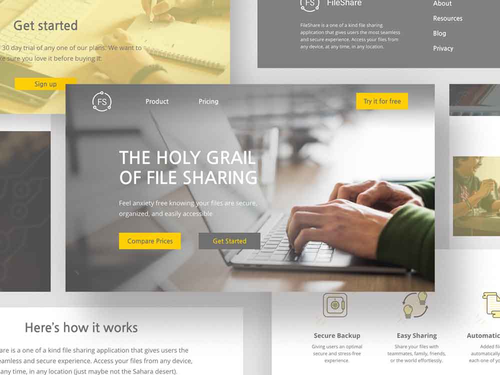
Here's what we're working with
FileShare is a file hosting service that allows users to backup, store, and share their files using a cloud-based approach. The target market for this particular service are users that are accumulating larger than average quantities of files, and small business owners.
The Ideas from my Brain
Sketching sketches
I started this project by sketching out a single-page, non-scrollable layout for each page. I wanted imagery to be the main focus of the website, making content as simple and brief as possible.
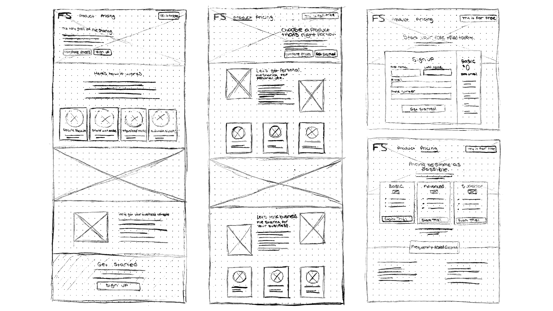
Since I had to establish a brand from the ground up, I wanted aspects of the brand's logo to be incorporated in elements throughout the website. This is illustrated in the website's iconography and image treatments.
I illustrated the icons to be straight forward, yet intriguing to look at. Starting with good old fashioned pen and paper, I tried to sketch out shapes and imagery that first came to mind when thinking of each service feature.
Cool sketches, right? Now let's see the final drafts. Each icon has a design in the background that is brought over from brand's logo. This was done to unify elements all throughout the website, while also helping the brand become more identifiable.
The process
Colour palette
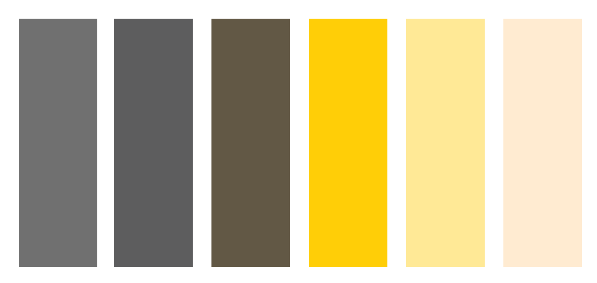
In order to establish a clear brand identity, one bold and distinct colour was chosen to be worked throughout the website while being grounded by various muted greys. Its treatment on buttons, icons, borders, and the logo make the website more identifiable and memorable to the user as they browse throughout.
Typography
NanumGothic is used for the headings, and is paired well with Open Sans for the body copy. These fonts read well on all screen sizes and work well with the website's professional tone.

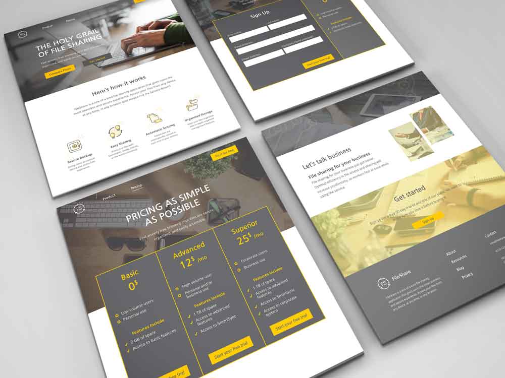
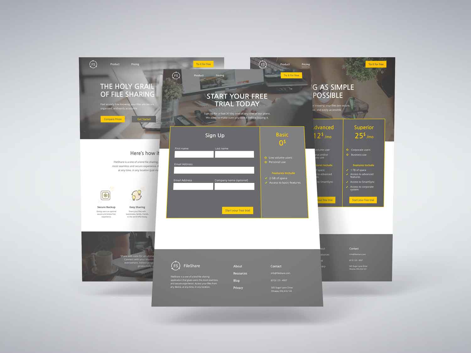
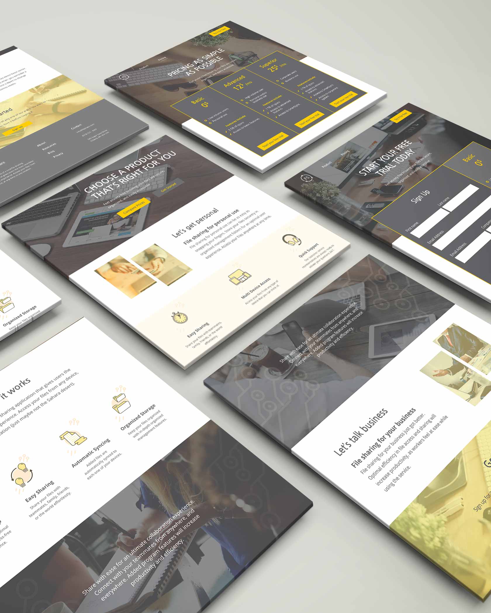
The outcome
Here's what the finished product looks like
The final result of the website is a clean and unique design. Each piece is carefully thought out in terms of how it's identified as a brand. I wanted this design to not only mirror a well-planned SAAS website, but also create a brand identity out of nothing.