Event Branding
A nature & camping themed baby shower
Branding, illustrations and stationairy
The Overview
The theme for this event was camping and nature inspired. The couple brought forth their passion for the outdoors and adventures in hopes that it would translate into a beautiful theme for the baby shower of their first child. Outdoor activities, woodland creatures, batonicals, you name it. Anything and everything that could be tied in with the exploration of mother earth was on the table.
The Ideas from my Brain
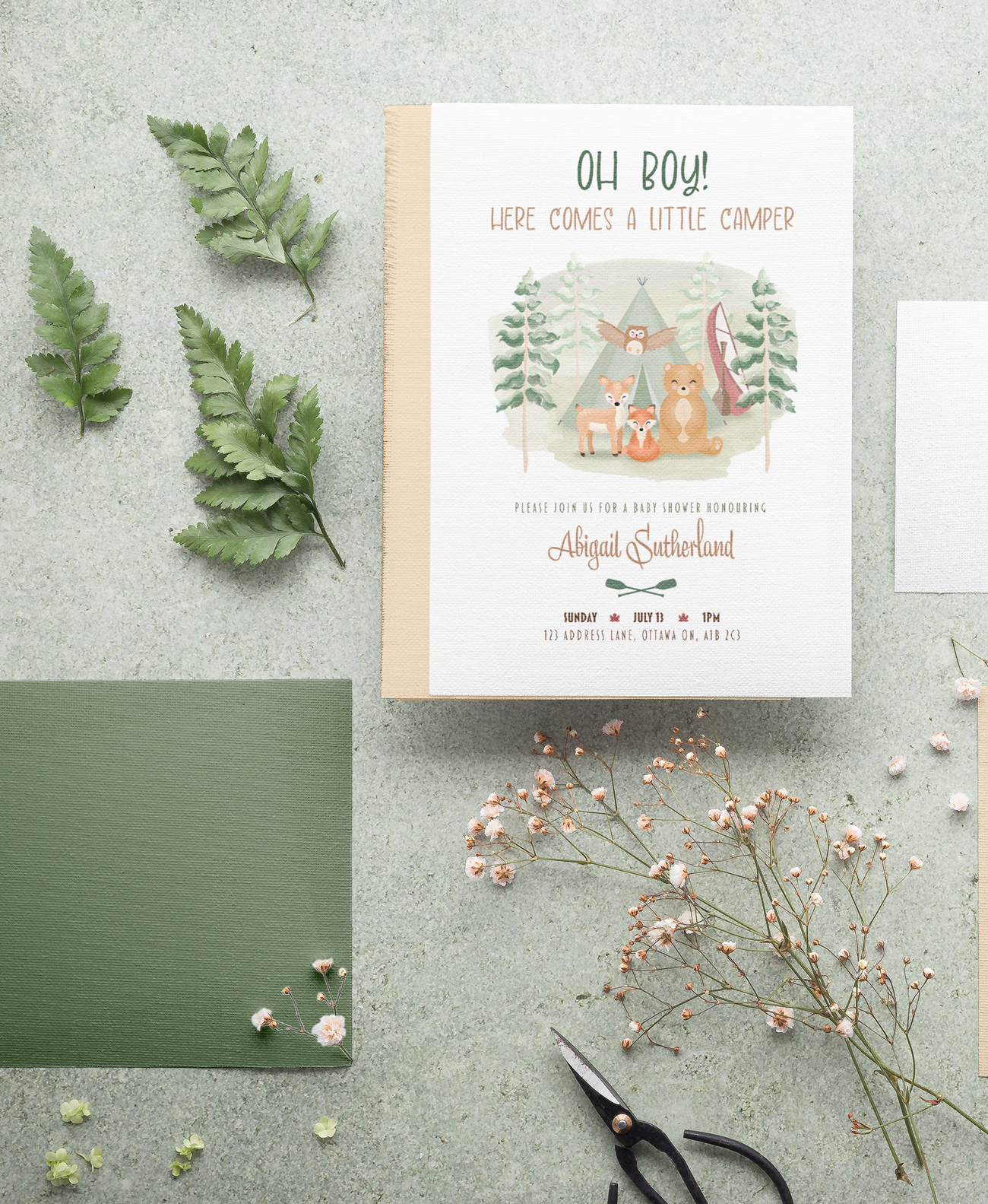
I wanted this project to be as customized as possible to the couple as can be. Bringing in elements that both soon-to-be parents love to do, I created a series of assets that incorporate the couple's love for camping, conoeing, and the outdoors. First up was the invitation card. The essence of the design was sweet and dear. A watercolour technique was used for the imagery to create lightness while also keeping with the outdoorsy, whimsical theme.
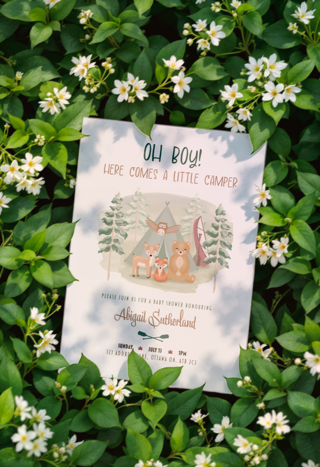
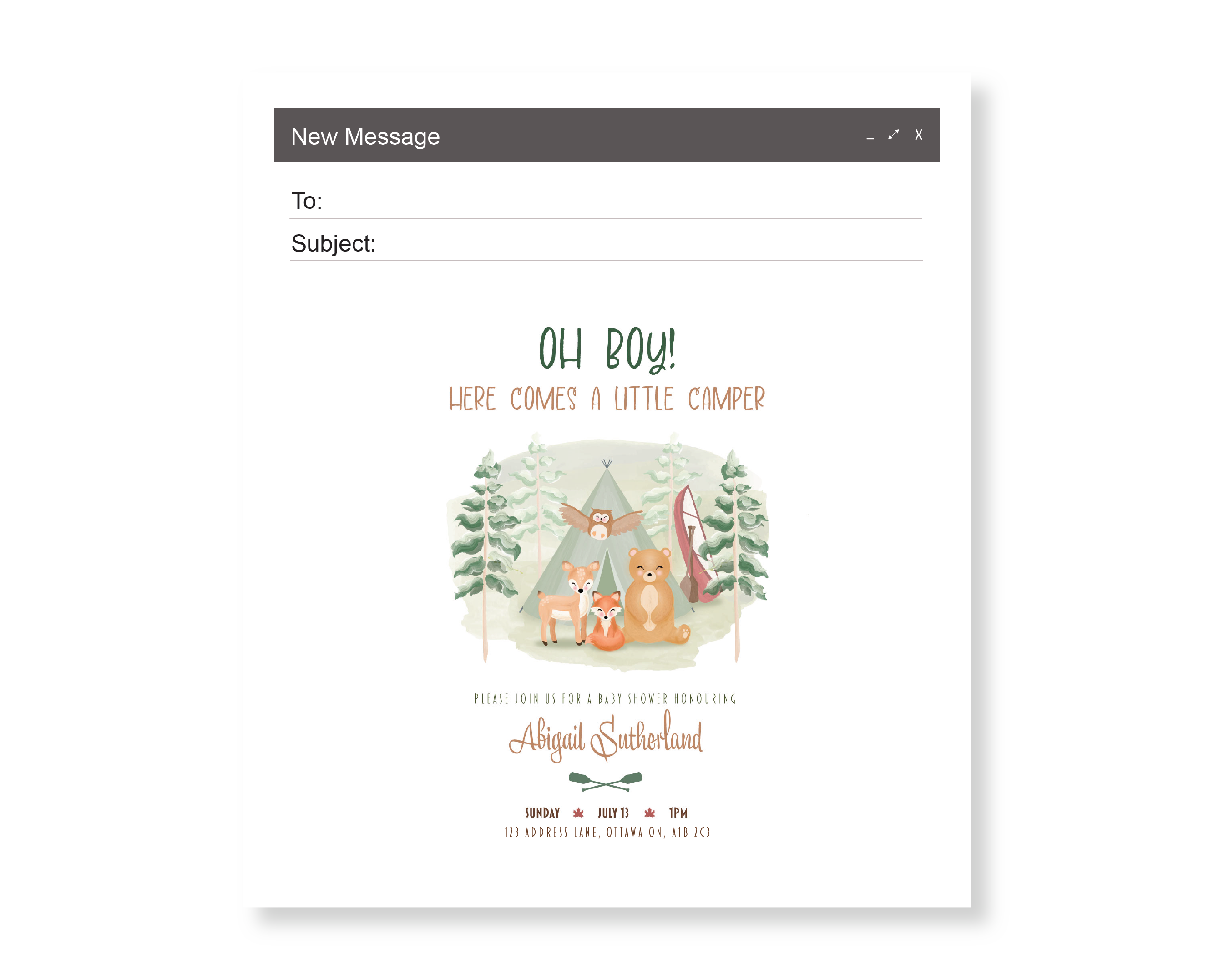
The invitation was designed to be versatile. A beautifully crafted scene of 4 woodland creatures in a forest setting can be reworkeed in several different ways to create a series of assets. It can be printed on cardstock, sent through email, and even posted on social media event groups.
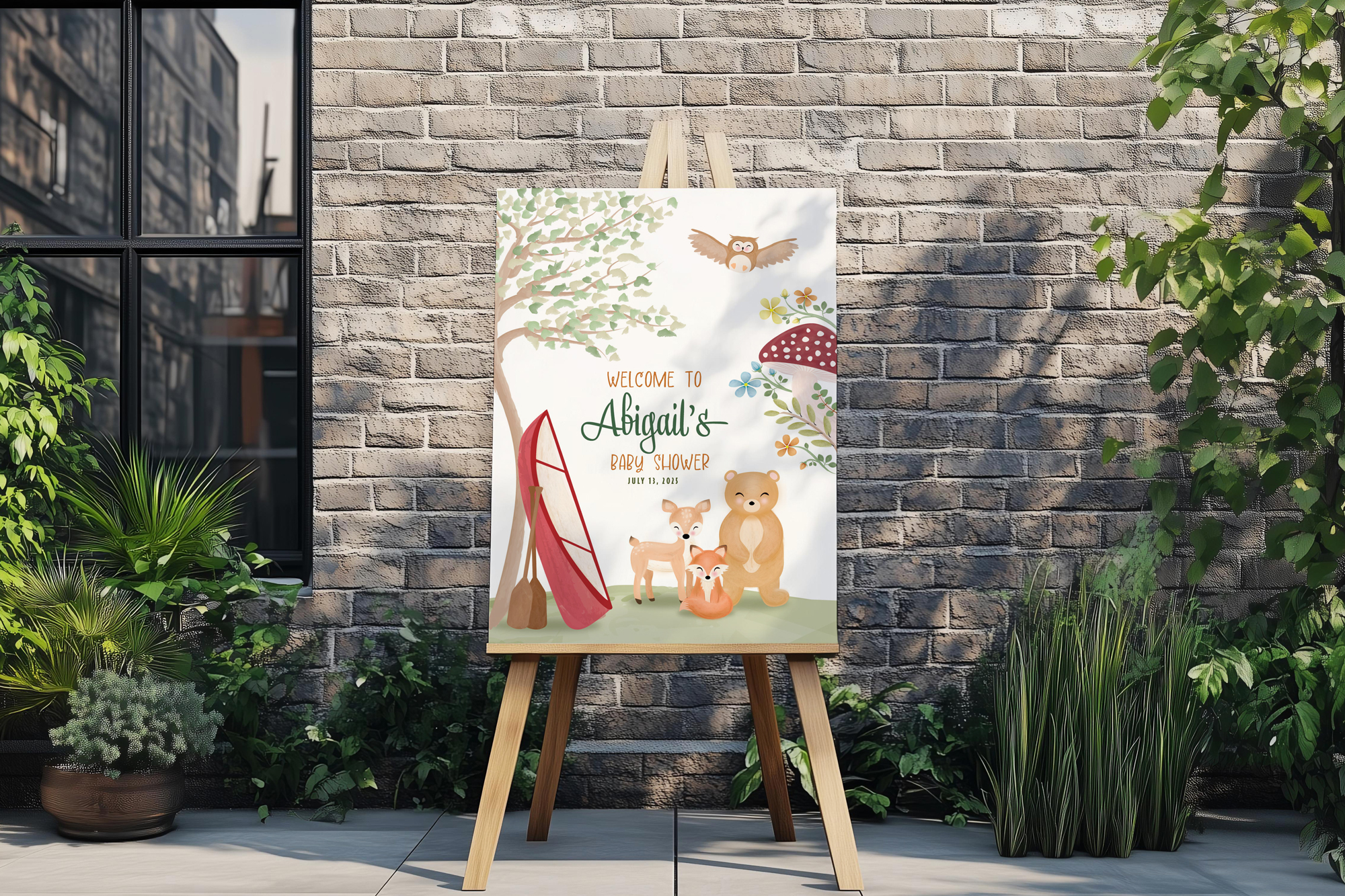
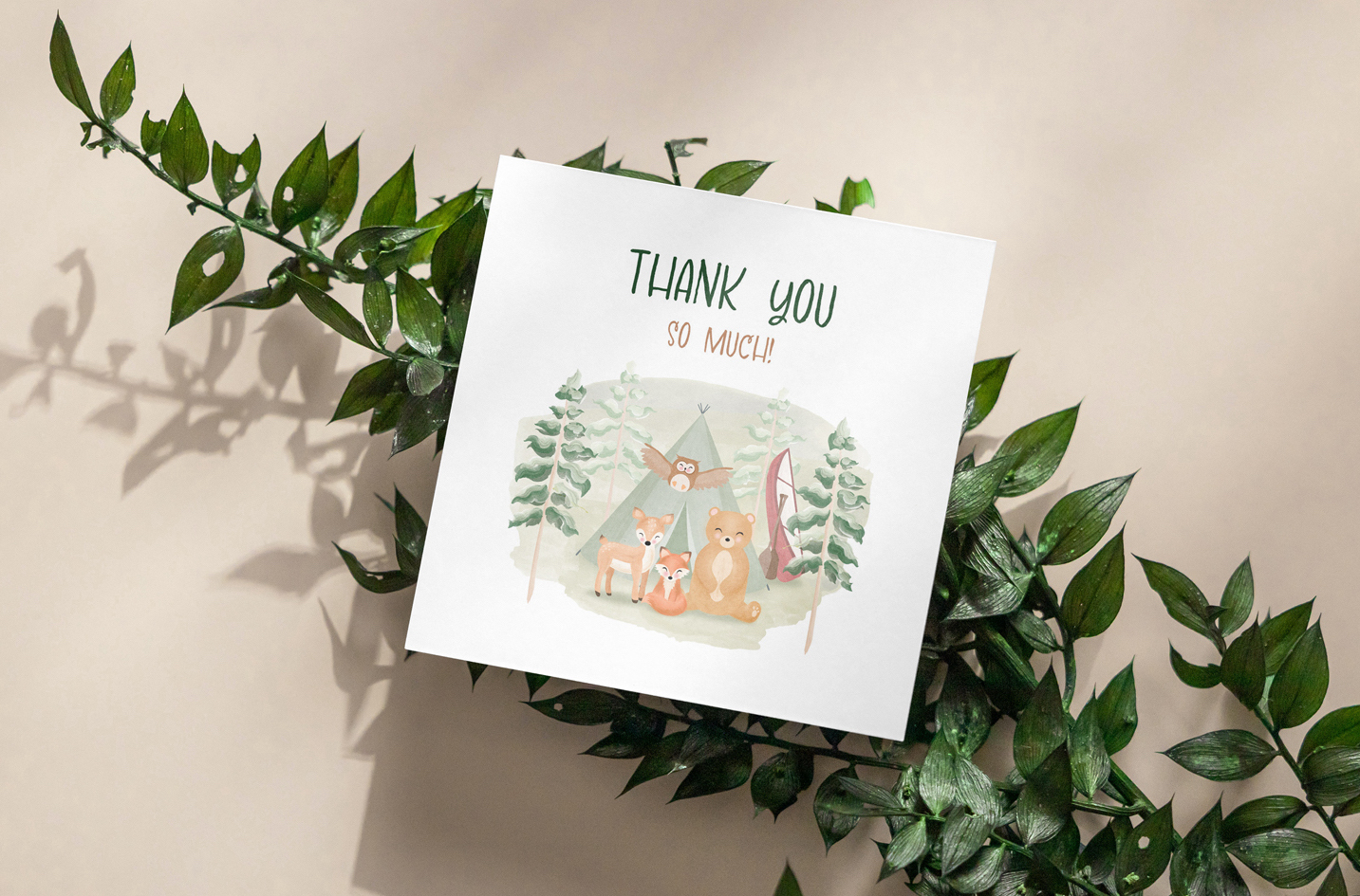
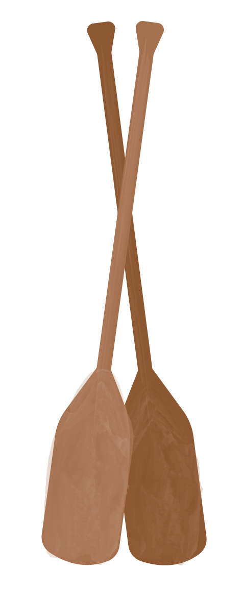
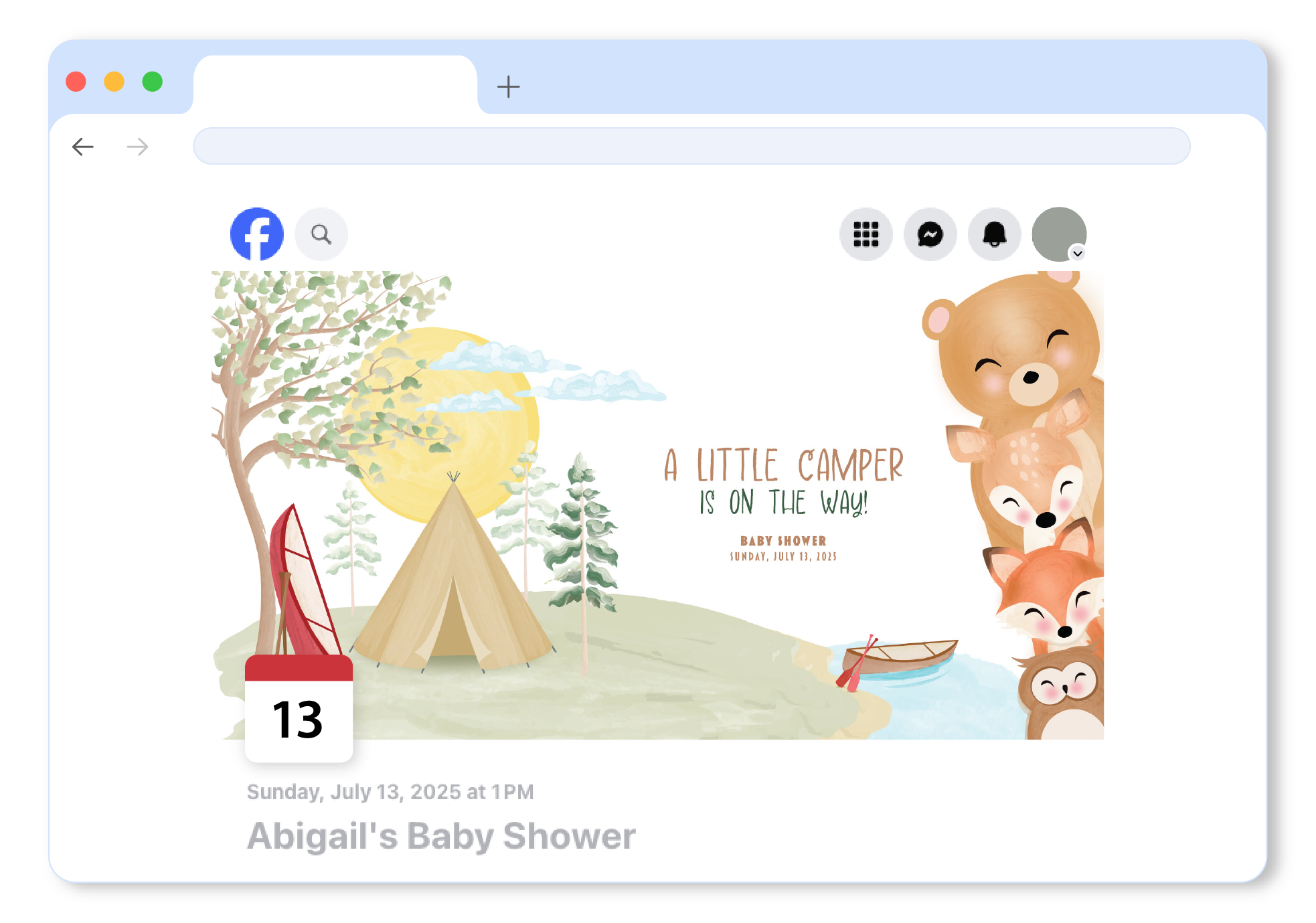
The design was reworked several times over to create a web banner and even a welcome poster for the day-of. I incorporated the couple's conoe in all of the imagery, as it was unique to them and representative of the adventures they had gone on thus far.
The process
Colour palette
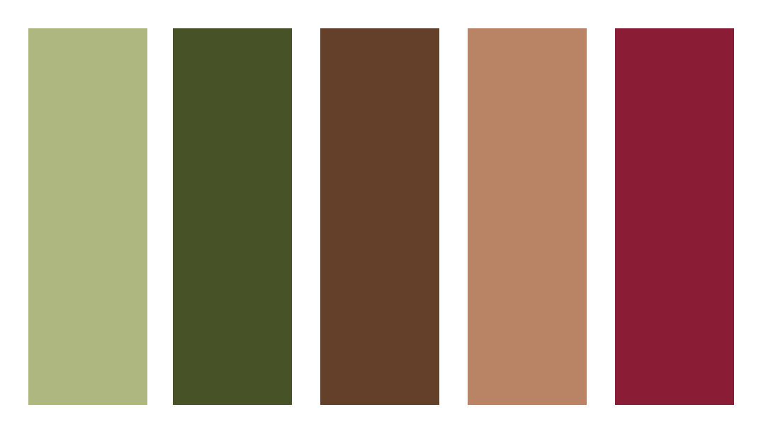
The colour palette for this theme was, of course, nature-oriented. Variations of green were used throughout for the main composition, while accents of browns, blues, and even reds were used for a customized look that was unique to the couple's story.
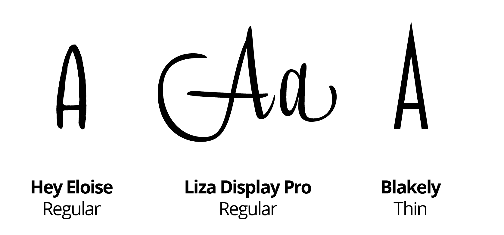
Typography
Hey Eloise was the project's main font. This fun and playful font was the ideal choice for the main content. Primarily for its whimsical lines that can be associated with youth (perfect for a baby shower!). Blakely was used for the secondary text, as its composition pairs perfectly with Hey Eloise. And finally, used very sparingly, Liza Display Pro was the best choice for a more elevated look.
The outcome
Here's what the finished product looks like
The final result is a beautifully designed set of assets that represent the couple perfectly. Every detail was crafted with care and consideration for the couple's personalities and passions. A design perfectly fit for the start of a new, adventurous family.